Flight graphs: new and enhanced

Flight graphs have always been an important tool for CloudAhoy debriefing. CloudAhoy can display graphs of selected parameters, and you can display graphs for the entire flight or only for selected segments. For example, you can display the altitude and airspeed of one decluttered traffic pattern out of many.

We redesigned the graphs:

  • It is now easier to correlate the flight segments the points of a graph,
  • We added multi-value temperature graphs – very useful for engine monitoring.

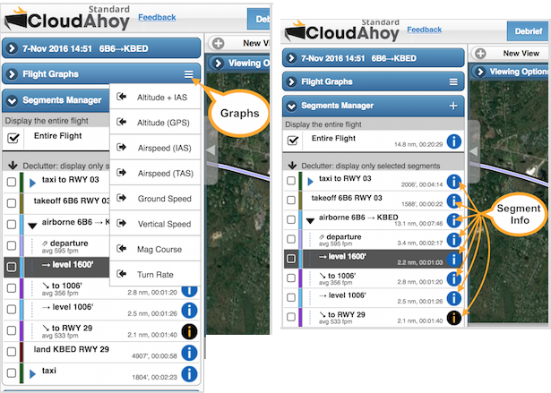
Reminder: graphs are displayed by clicking or tapping the menu icon  on “Flight Graphs”, or on a Segment Info icon .


When you display a graph from Flight Graphs, you can undock it , move it and resize. You can display a graph for the entire flight, or only for selected segments. More information here.

Using Graphs
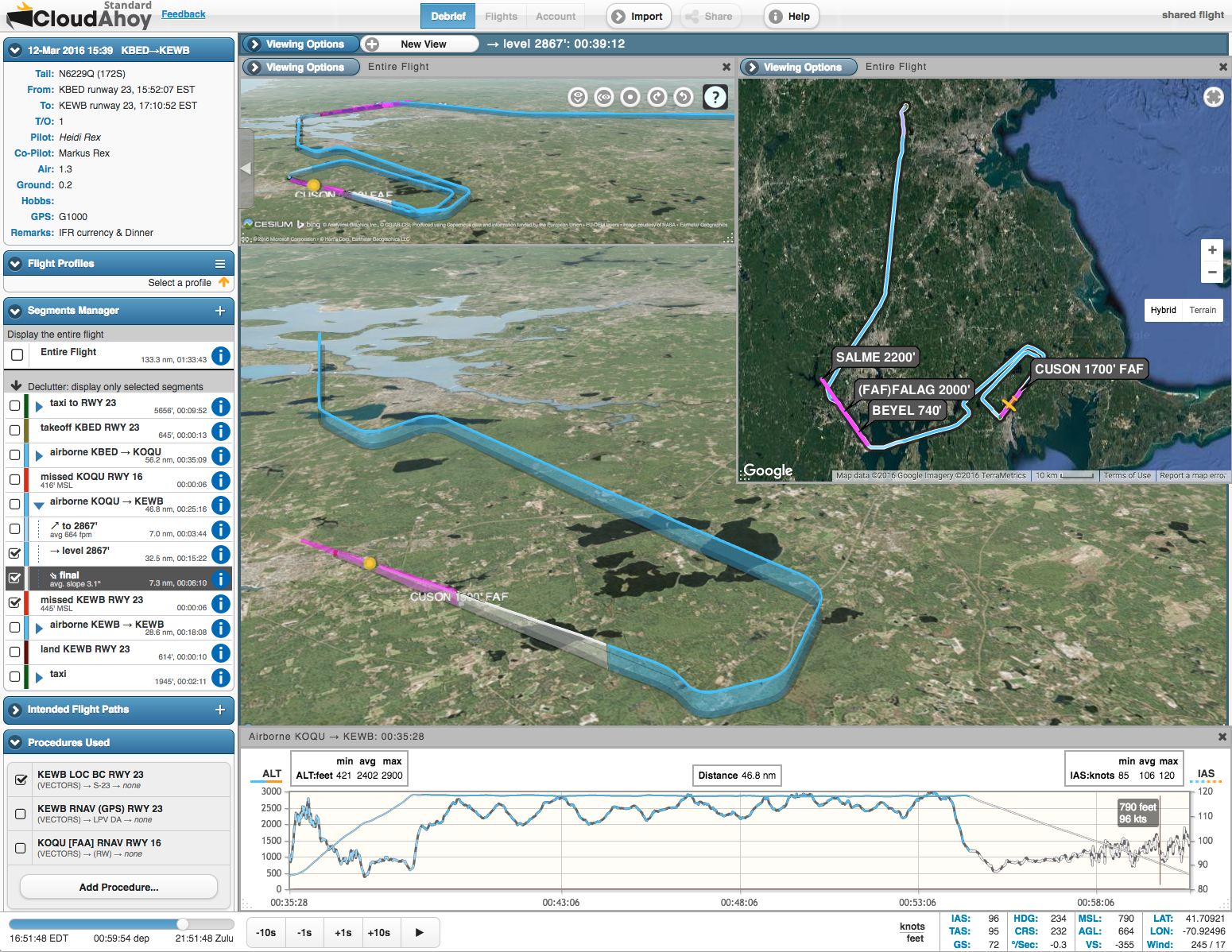
Consider the cross-country flight in the debrief window below.

When debriefing, probably the two most useful graphs are the altitude and airspeed. You could display them separately, in two graph windows, or select a combined “ALT+IAS” graph. We selected “ALT+IAS”.

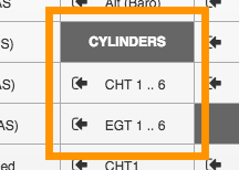
In this specific case, the aircraft (SR22T) was new, and we wanted to check the cylinder head temperatures. CloudAhoy now support multi-value graphs of CHT and EGT, and we selected “CHT 1..6”. CHT information is available when importing the flight from an EFIS such as, in this case, Garmin Perspective.

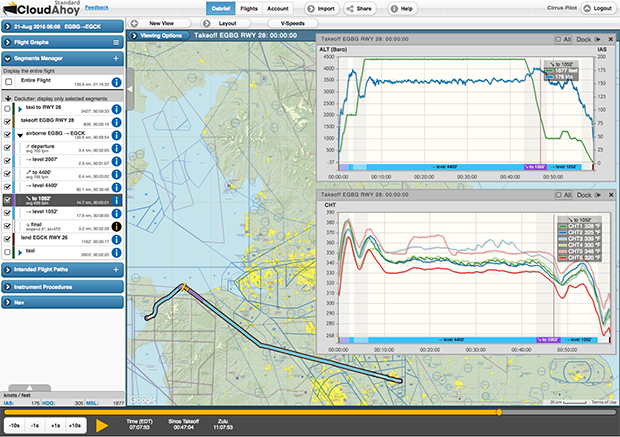
Below we will explore the new look of these graphs.


IMPROVED: easier to correlate the points of a graph to the flight segments
All CloudAhoy graphs have the same structure. Notice the segment names at the bottom, along the X axis.

Referring to the annotations in the screenshot above:

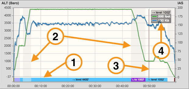
  1. The flight segments are displayed on the X axis of the graphs. You can see at a glance that the pilot climbed to 4400′, flew  , then descended , etc. The segments are color coded, using the same colors of the corresponding segments in the flight track. If space allows, we display the segment’s name. In the example above, only three segments were wide enough to display their names.
  2. We use shades to separate segments, making it easier to correlate graph values to segments.
  3. The crosshair shows the current time. You can drag it to move the time.
  4. We display the current graph values in a box adjacent to the crosshair. In this case two graphs are shown: the green is the altitude and the blue is the indicated airspeed. Note that we display the current segment’s name above the values. It is useful in cases when the segment’s time is too short for displaying its name on the segment list below.

NEW: multi-value temperature graphs
If you import data from an EFIS such as Garmin Perspective or Garmin 1000, you can now display individual cylinder’s CHT and EGT graphs, or combined CHT / EGT of all cylinders. The screenshot on the right shows the new graph menu items, displayed by clicking or tapping the menu icon  on “Flight Graphs”.

Below is the CHT 1..6 graph from the picture above. It is now easy to correlate temperature changes to the segments of the flight, in this case climb, level and descent.

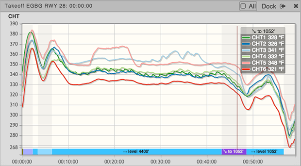
The CHT and EGT graphs are useful for spotting an abnormal temperature of an individual cylinder, and for debriefing the effects of rapid descents on the engine’s temperatures.

New: Runway info – touchdown & threshold

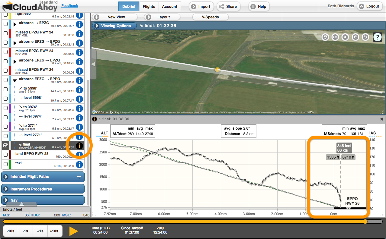
How precise are your landings?

We released an update to the Segment Info of approach segments.

In the landing screenshots on the right and below we can see at a glance:

  • The runway is depicted as a thick black line.
  • The pilot landed on EPPO RWY 28.
  • The touchdown was at 1506’. Till that point the runway is displayed to-scale.
  • The runway remaining was 6710’.
  • Over the threshold the aircraft (SR22T) was at MSL=346′ and airspeed of 86 KIAS.
  • The short approach was stabilized: on the glidepath, with stable airspeed.

To display the Segment Info of the Final we clicked the icon in the segment list. Note the runway depiction in thick line on the lower-right. Click the picture below for details. To check the airspeed and altitude over the threshold, we dragged the time crosshair to the runway threshold.

Along with the depiction of the runway, Segment Info graphs have been enhanced in these ways:

  • The x-axis along shows the distance from the runway threshold, or in the case of a missed approach the point at which the missed approach started.
  • The touchdown point is labeled with the distance from the threshold to touchdown, as well as the length of runway remaining after the touchdown.
  • The airport and runway number are shown just above the runway.

Important
The accuracy of determining the location of the touchdown point depends on the data quality. An external GPS with good sky visibility will yield better accuracy than logging with your phone or tablet’s internal GPS. For best accuracy, import the flight data from your EFIS. See this.

Flights tab: adjustable layout and time display

We released a revised version of the Flights tab, with two important improvements.


The layout of the Flights tab is now adjustable

The Flights tab consists of two parts: the flight list (left) and the selected flight’s details (right). A new handle, on the vertical border between the two parts, allows you to close or open the selected flight’s details. Click or tap the handle to toggle open/close.

This adjustable layout is especially handy on narrow displays such as the iPad when you want to view the Remarks fields of all the flights in full.
Reminder:  you can always search for flights with specific text in the Remarks (as well as search other flight parameters) using  Search on the upper-left.

This functionality is available on the iPad in CloudAhoy app, or in Safari. It is also available on the iPhone in Safari; it is not yet available in the iPhone’s CloudAhoy app. 


Decimal display of air and ground times (in addition to H:M:S)

Useful for logbook entries – the Air and Ground times are now displayed in decimal values as well.

CloudAhoy 5.0 – last day of “5.0 Special”

We released CloudAhoy 5.0 on Valentine’s Day, February 14 2017.

What is “CloudAhoy 5.0 Special” ?
Each and every user gets a FREE MONTH of CloudAhoy Standard. The “5.0 Special” ends today, March 14 2017.

What is CloudAhoy 5.0?
It’s a new generation of our power debrief tool, available to all CloudAhoy users – whether you debrief on the web (Windows, Mac, Android, Linux) or in our iOS apps.

Highlights

  • New Approach analysis: check how stabilized your approach was
    Our enhanced flight analyzer detects, computes and displays approach information.
  • New VFR / IFR charts, worldwide
    We partnered with SkyVector to provide high quality and up to date charts.
  • Redesigned Flights tab
    Including a powerful flight search, thumbnails, and manuever list per flight.

We also released a new version of our iOS app, supporting pilot roles: you can now specify the role of each pilot (e.g., co-pilot, CFI) and whether he or she are the PIC. A new version of our Android app is in the making.

A redesigned decluttering tool

declutteriapDecluttering is useful for focusing on specific segments of a flight. It is especially helpful in training and currency flights, which tend to have multiple maneuvers and complex flight paths. We recently redesigned our declutter tool, integrating it with the tools in the left panel.

More information: watch the short video below, and read step by step instructions here.

Decluttering is a powerful debriefing technique. Examples: focus only one one traffic pattern out of five, one instrument approach out of three, or isolate and view a steep turn manuever.