Flight graphs have always been an important tool for CloudAhoy debriefing. CloudAhoy can display graphs of selected parameters, and you can display graphs for the entire flight or only for selected segments. For example, you can display the altitude and airspeed of one decluttered traffic pattern out of many.
We redesigned the graphs:
- It is now easier to correlate the flight segments the points of a graph,
- We added multi-value temperature graphs – very useful for engine monitoring.
Reminder: graphs are displayed by clicking or tapping the menu icon ![]() on “Flight Graphs”, or on a Segment Info icon
on “Flight Graphs”, or on a Segment Info icon ![]() .
.
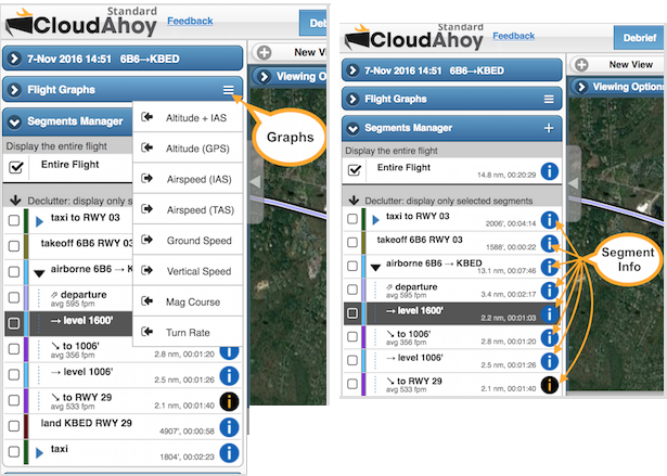
When you display a graph from Flight Graphs, you can undock it ![]() , move it and resize. You can display a graph for the entire flight, or only for selected segments. More information here.
, move it and resize. You can display a graph for the entire flight, or only for selected segments. More information here.
Using Graphs
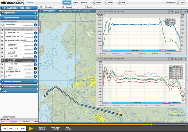
Consider the cross-country flight in the debrief window below.
When debriefing, probably the two most useful graphs are the altitude and airspeed. You could display them separately, in two graph windows, or select a combined “ALT+IAS” graph. We selected “ALT+IAS”.
In this specific case, the aircraft (SR22T) was new, and we wanted to check the cylinder head temperatures. CloudAhoy now support multi-value graphs of CHT and EGT, and we selected “CHT 1..6”. CHT information is available when importing the flight from an EFIS such as, in this case, Garmin Perspective.
Below we will explore the new look of these graphs.
IMPROVED: easier to correlate the points of a graph to the flight segments
All CloudAhoy graphs have the same structure. Notice the segment names at the bottom, along the X axis.
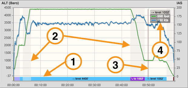
Referring to the annotations in the screenshot above:
- The flight segments are displayed on the X axis of the graphs. You can see at a glance that the pilot climbed to 4400′, flew
 , then descended
  , etc. The segments are color coded, using the same colors of the corresponding segments in the flight track. If space allows, we display the segment’s name. In the example above, only three segments were wide enough to display their names.
 - We use shades to separate segments, making it easier to correlate graph values to segments.
- The crosshair shows the current time. You can drag it to move the time.
- We display the current graph values in a box adjacent to the crosshair. In this case two graphs are shown: the green is the altitude and the blue is the indicated airspeed. Note that we display the current segment’s name above the values. It is useful in cases when the segment’s time is too short for displaying its name on the segment list below.
NEW: multi-value temperature graphs
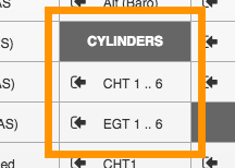
If you import data from an EFIS such as Garmin Perspective or Garmin 1000, you can now display individual cylinder’s CHT and EGT graphs, or combined CHT / EGT of all cylinders. The screenshot on the right shows the new graph menu items, displayed by clicking or tapping the menu icon ![]() on “Flight Graphs”.
on “Flight Graphs”.
Below is the CHT 1..6 graph from the picture above. It is now easy to correlate temperature changes to the segments of the flight, in this case climb, level and descent.
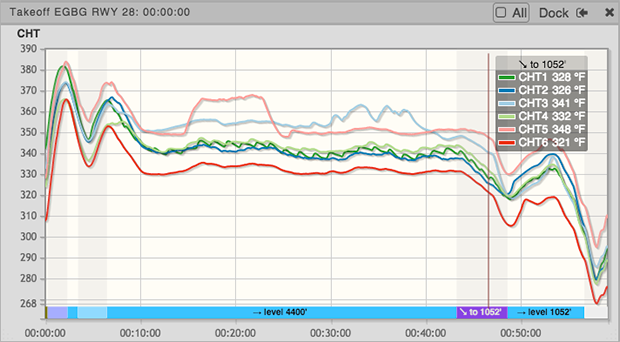
The CHT and EGT graphs are useful for spotting an abnormal temperature of an individual cylinder, and for debriefing the effects of rapid descents on the engine’s temperatures.