Safety Events, Trends, and more – PREVIEW

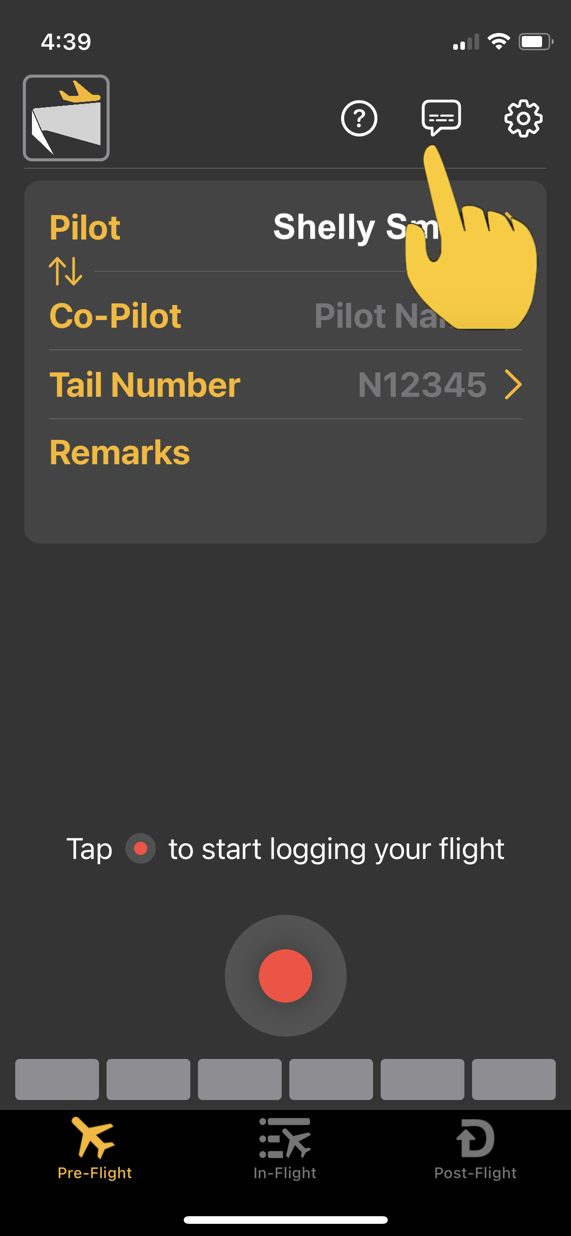
During the last year we have been focused on adding capabilities to CloudAhoy with an emphasis on safety.  The capabilities we’ve worked on include  automatically detecting unsafe moments in flights and analysis of aggregated data to identify trends.

The work is ongoing, and not yet released. We are working closely with our partners – flight schools, owners and operators – to create a valuable product that fits into their workflow. We are at the point that we can share some examples and what’s coming next.


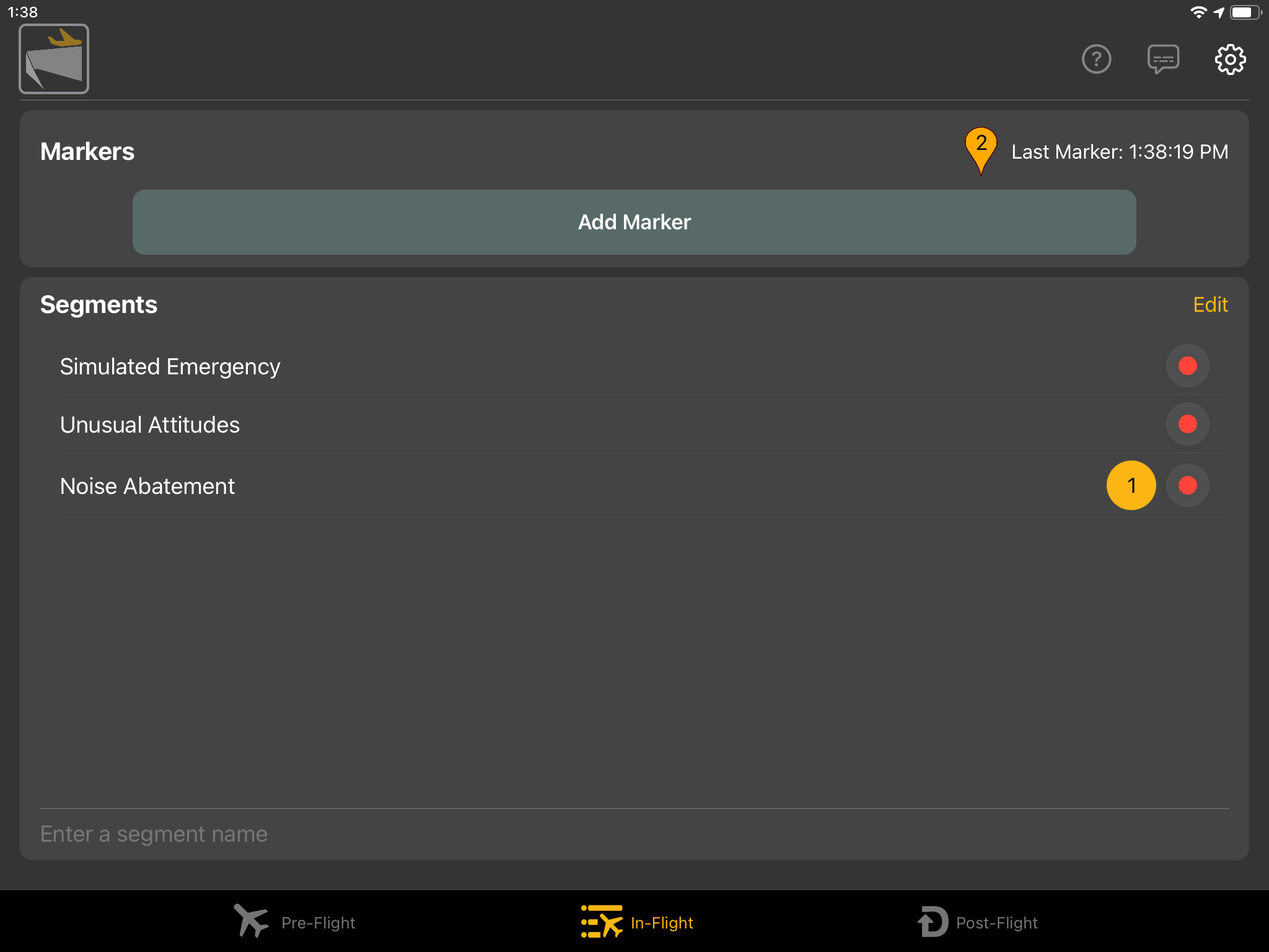
Safety events – Automatically Detected

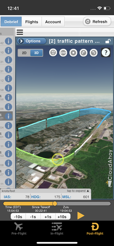
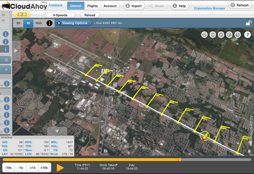
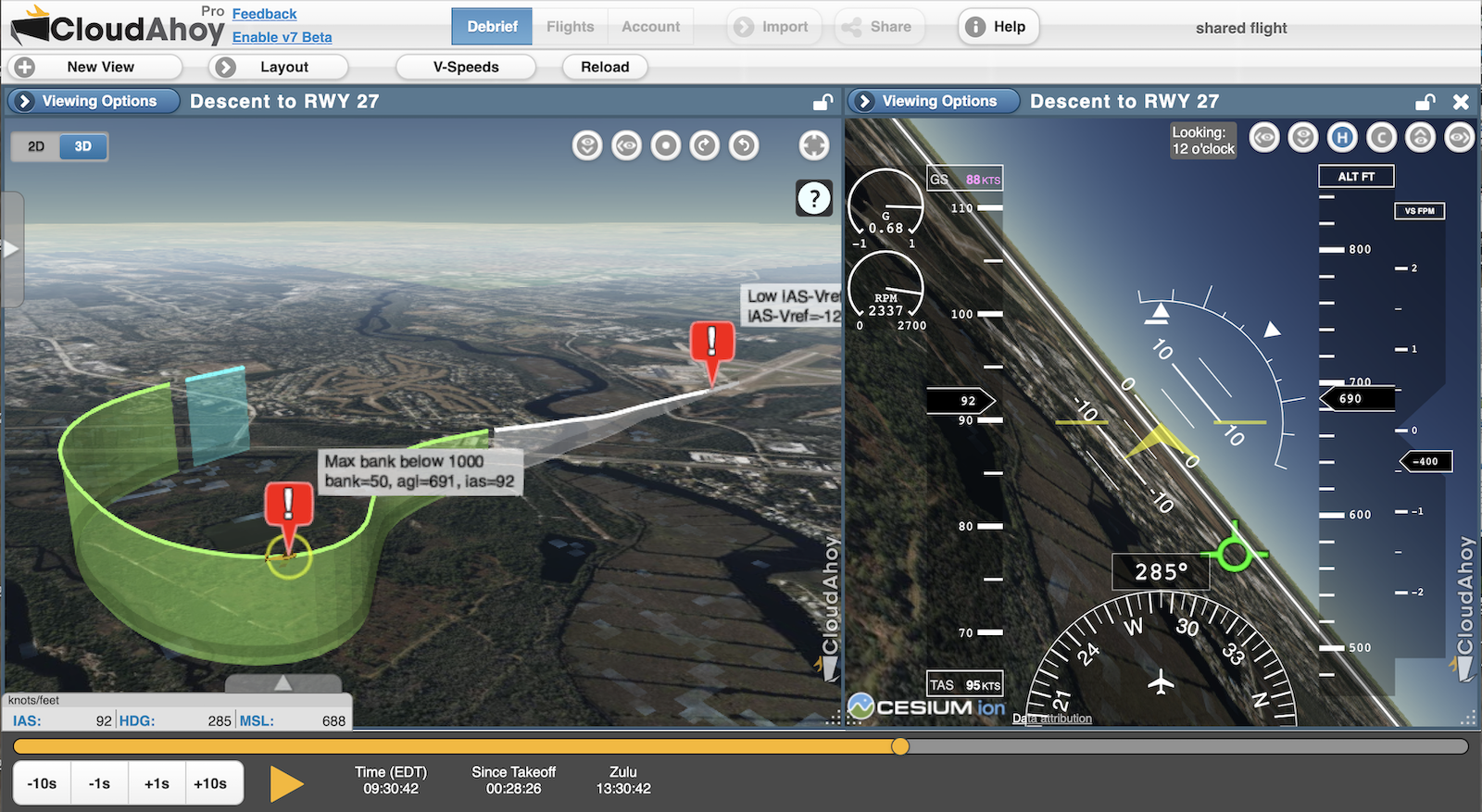
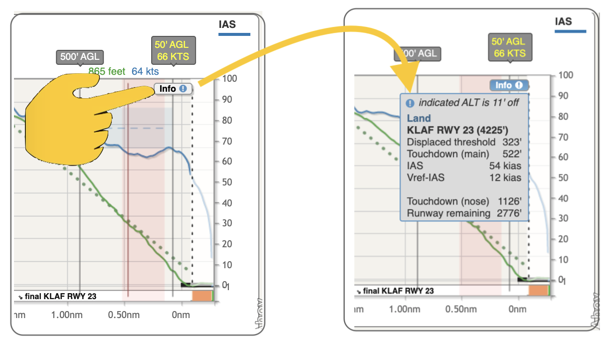
Example – Unsafe base-to-final turn: The pilot overshot the turn to final, and corrected it by making a turn with a steep bank.

  • CloudAhoy detected the steep angle of the turn back to the final and annotated it in the debrief.


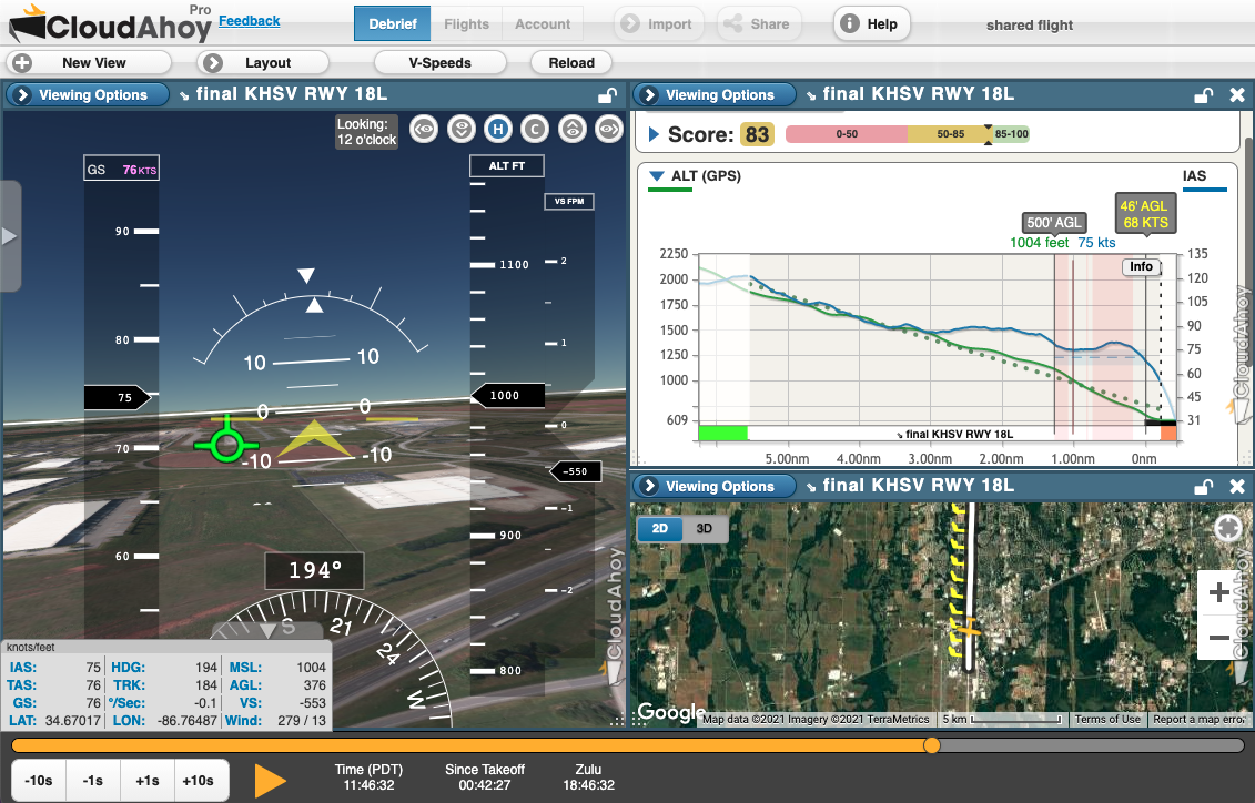
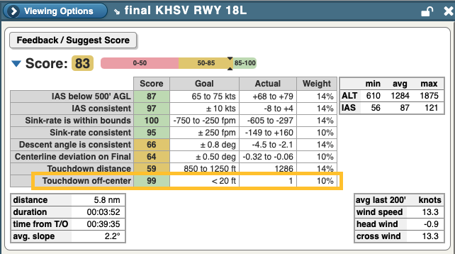
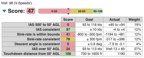
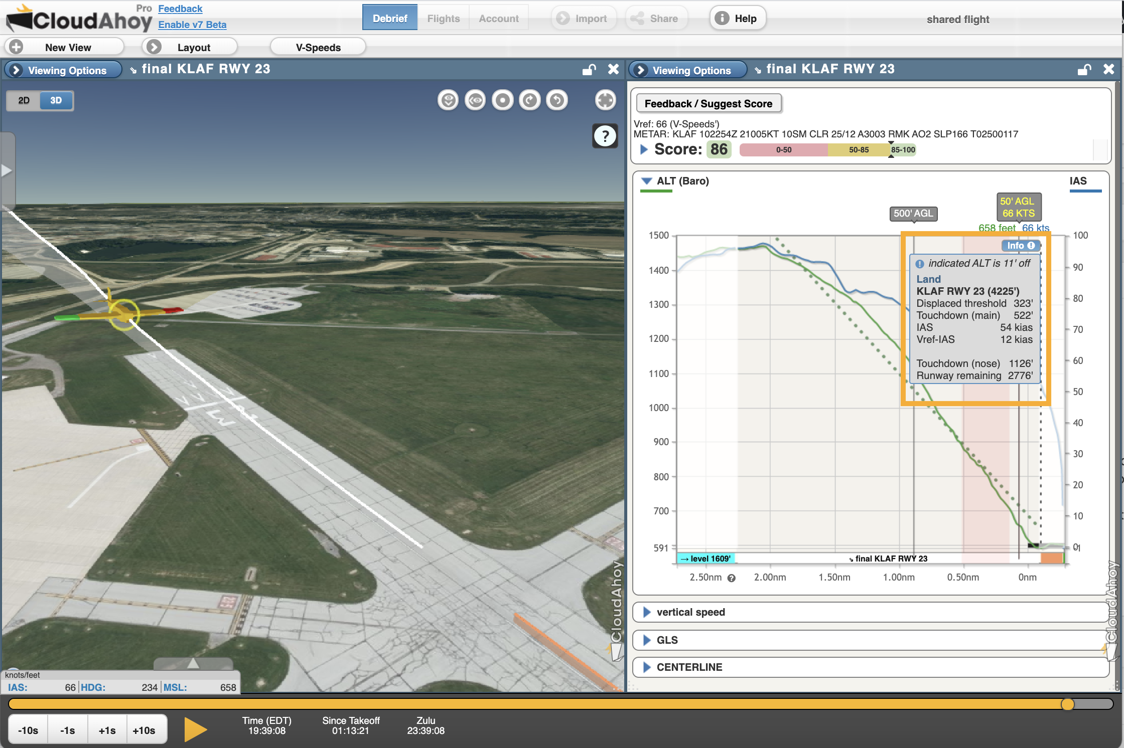
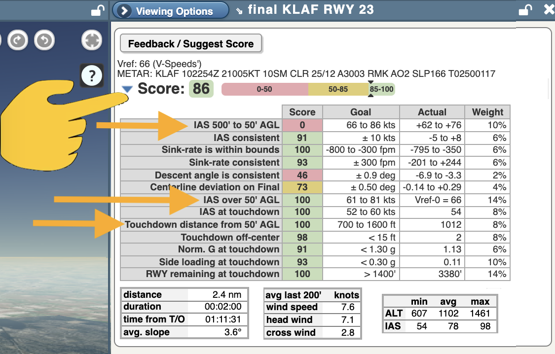
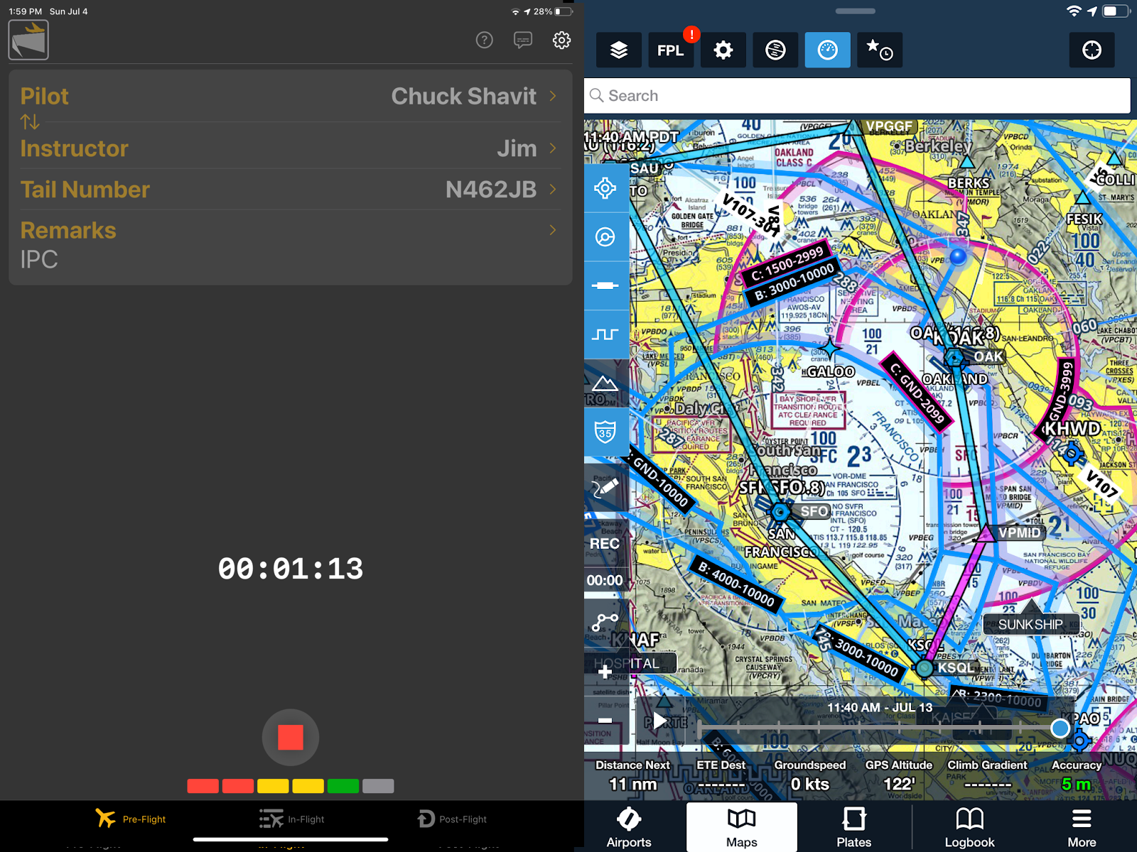
Example – Cause and effect: A pilot came in 16 knots too fast, landed long, and used almost the entire runway (and probably slammed on the brakes).

  • CloudAhoy detected 2 safety events: airspeed too high  at 50’AGL, and being too fast during rollout  approaching the end of the runway.

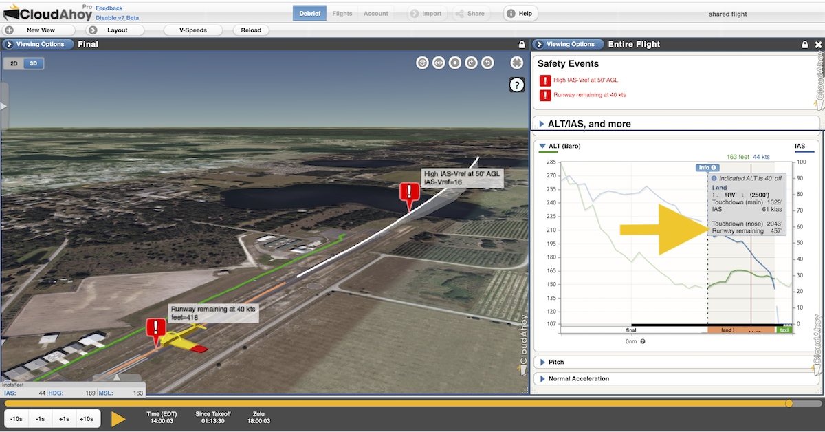
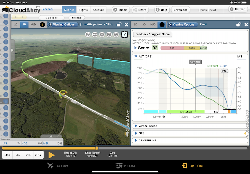
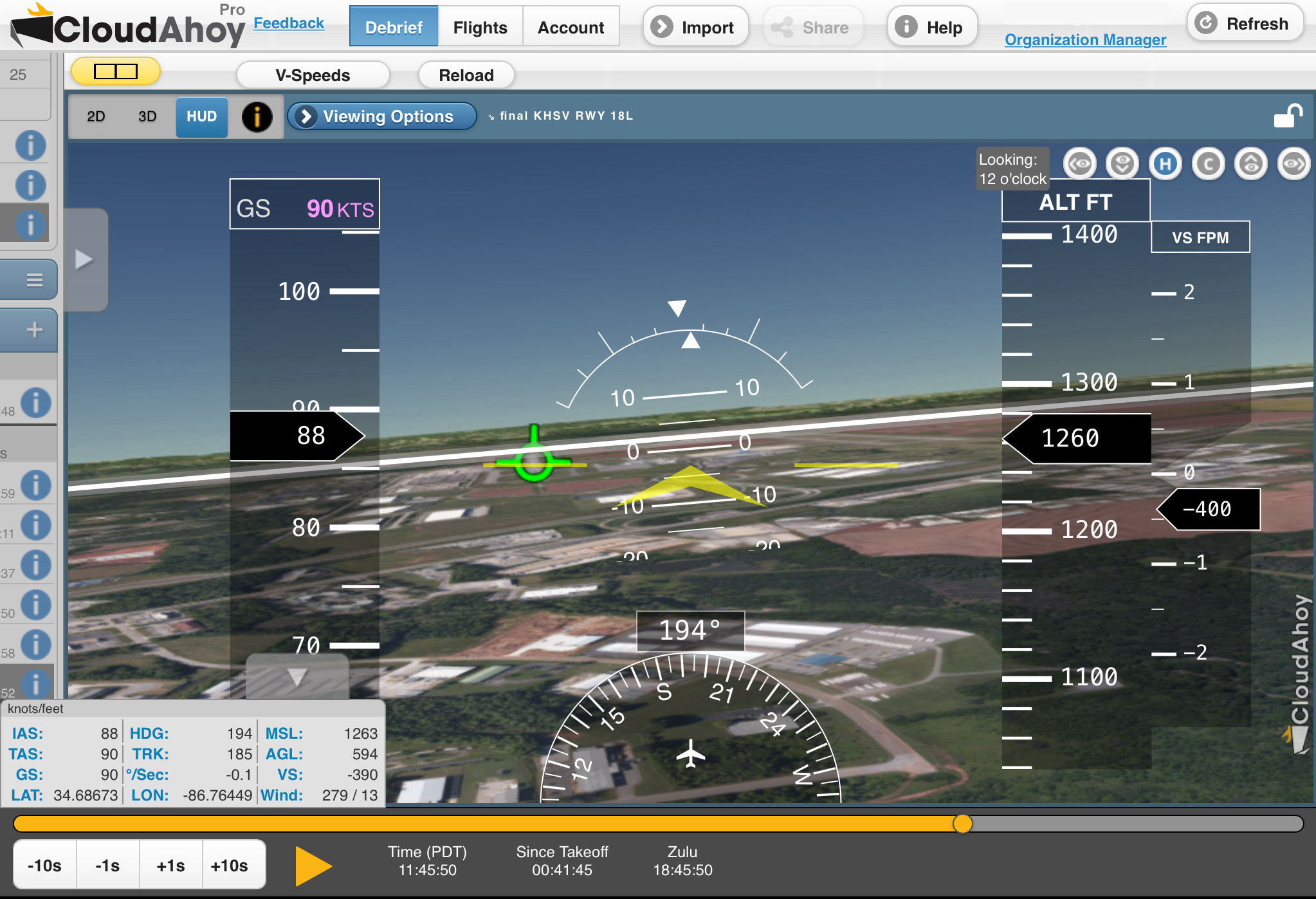
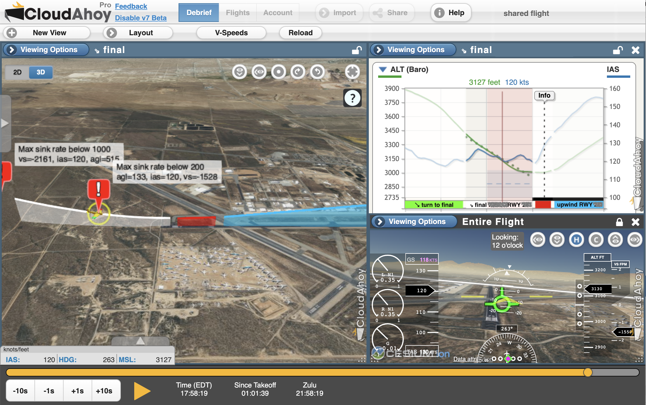
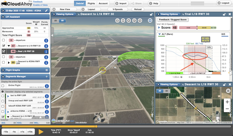
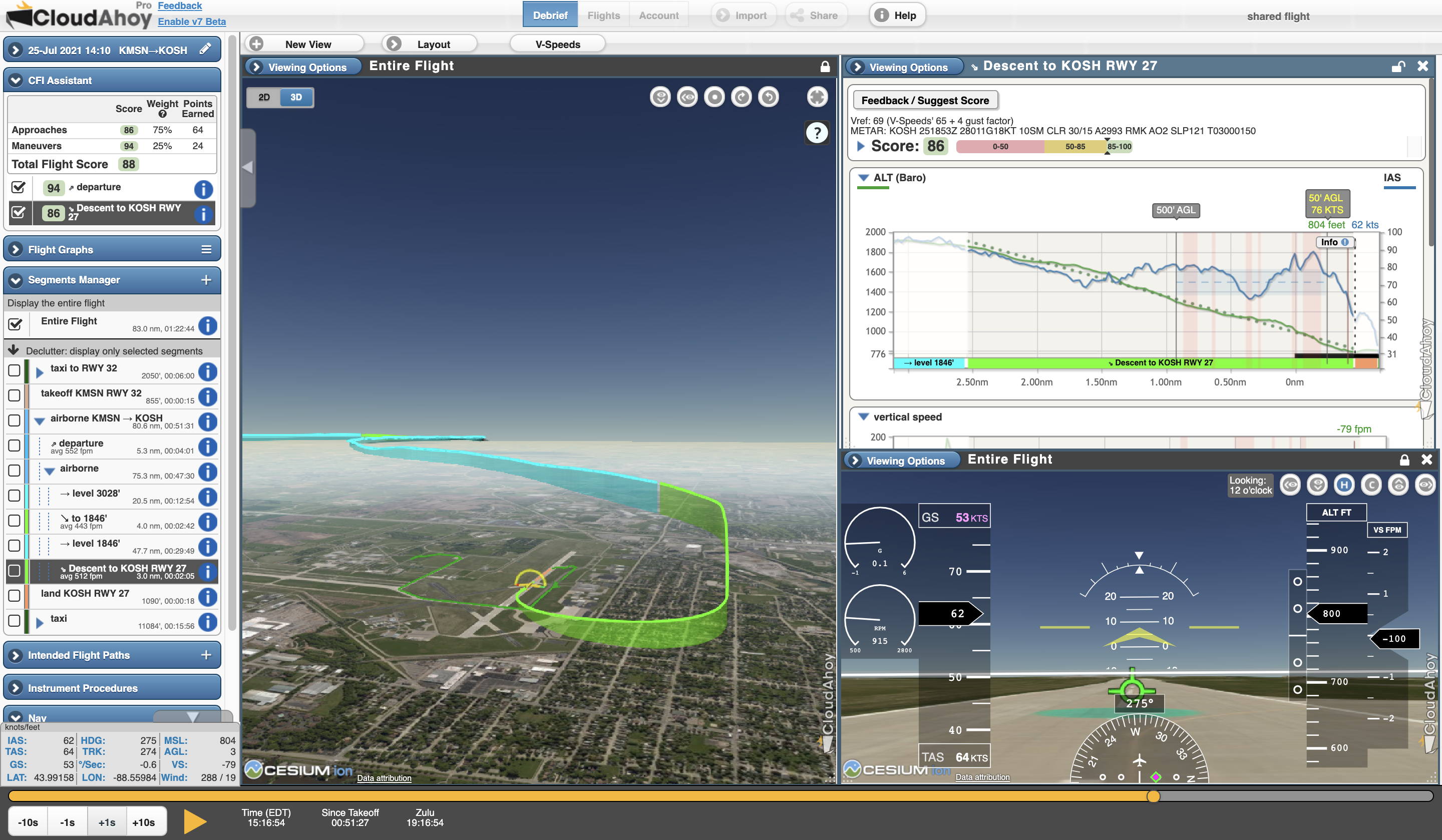
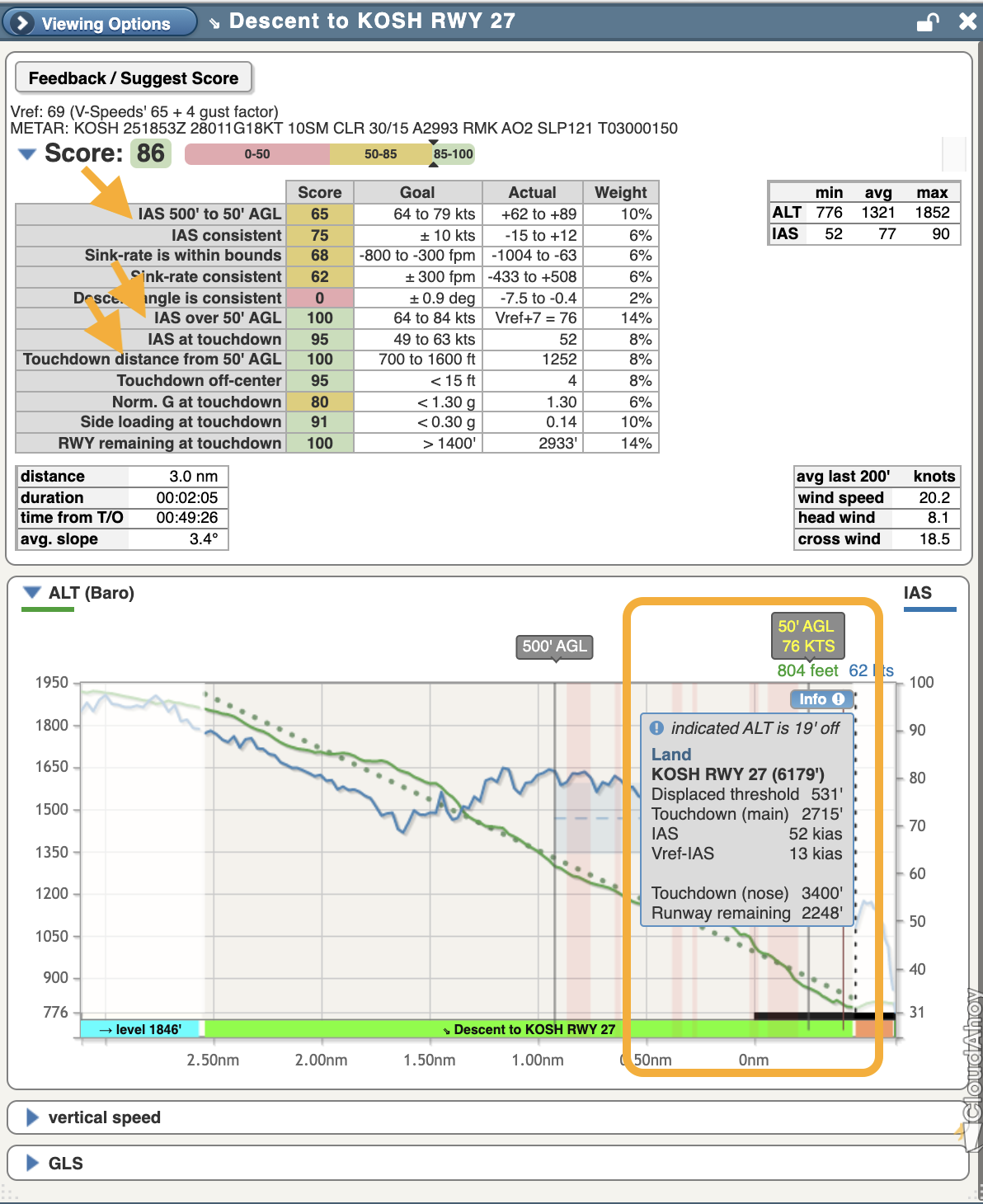
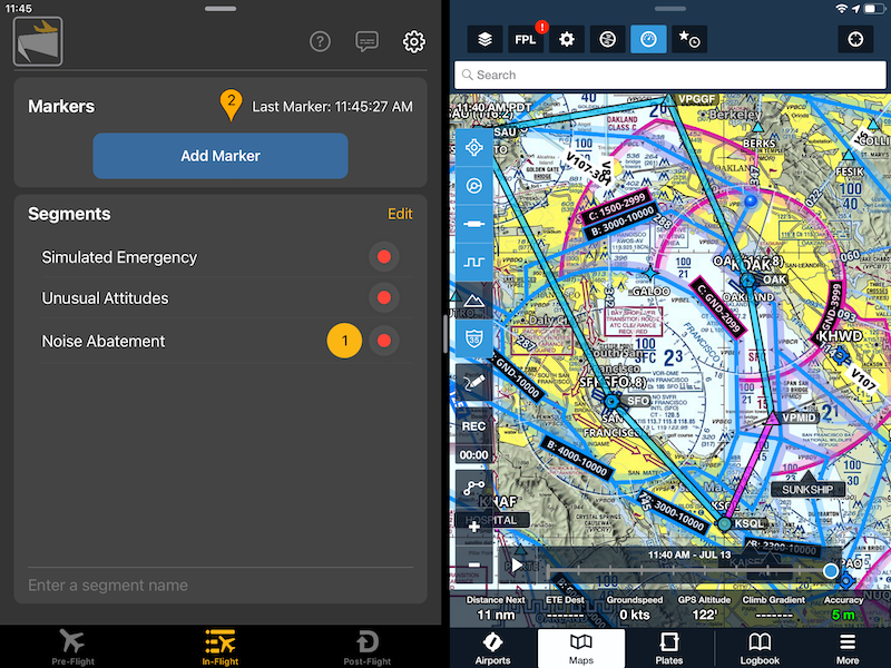
Example – Safety event and decision making: The pilot came in too high on final approach, then tried to correct with an excessive sink rate. The result was an unstable approach.

  • CloudAhoy detected a safety event: sink-rate too high at 515′ AGL and at 133′ AGL. The pilot decided to go around (the red segment) – which was the safe thing to do!


What General Aviation Can Learn from the Airlines about Safety

“You can’t improve what you don’t measure.” [– Peter Drucker]

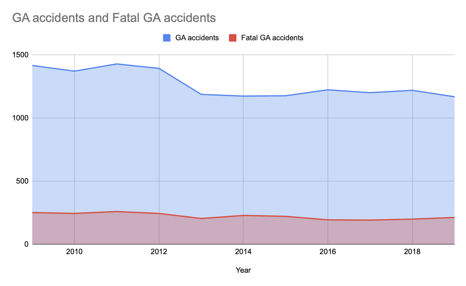
Over the past 20 years, the Airlines’ accident and fatality rate had dropped significantly. One of the main contributing reasons for it is that the Airlines implemented safety programs – known as Flight Operations Quality Assurance (FOQA) and FDM (Flight Data Monitoring). The airlines implemented monitoring and measuring techniques to understand flight safety, and translated that into actions to improve safety, such as training and Standard Operations Procedures. As a result accidents and fatality rates dramatically decreased.  

Unfortunately, in General Aviation and in Business Aviation the accidents and fatality rates are stagnant.  We believe it’s time to bring the techniques used by the airlines to every GA pilot – to save costs, and most importantly – life. Detection of safety events is a natural progression of CloudAhoy.


Source:  General aviation trends in charts—2021 update,
OCTOBER 4, 2021/ by JOHN ZIMMERMAN 


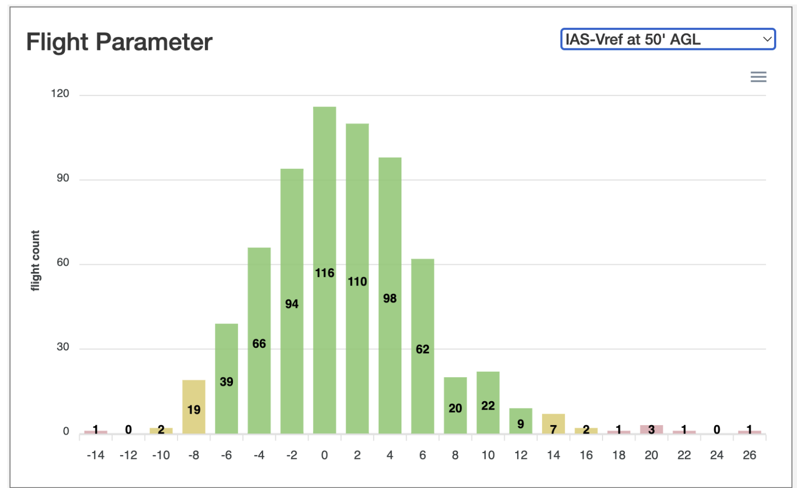
Looking at trends can be a good way to identify bad habits and unsafe behavior.  As an example, the following screenshot shows a CloudAhoy histogram of the approach speed across hundreds of flights during a certain time period. CloudAhoy compares the Indicated Airspeed in each approach to the desired speed (Vref). The vast majority of the approaches were safe, “in the green”. Yellow and pink colors indicate flights that were too slow or too fast.

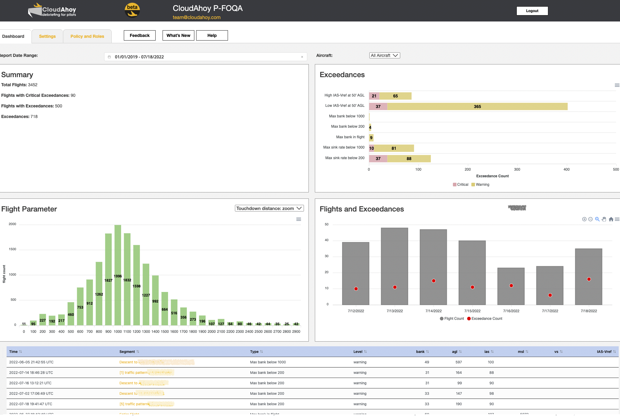
Introducing CloudAhoy P-FOQA / FDM
“P” is for Pilot 

CloudAhoy’s P-FOQA is pilot-centric (hence the “P”).  

P-FOQA is tailored for General Aviation and is modeled after similar programs used by the airline industry. It is designed for business aviation, flight training, owners/operators, and fleet managers.  The safety events – such as described above – are automatically detected by CloudAhoy and presented on a dashboard. 

CloudAhoy’s P-FOQA is using the same underlying technology as CloudAhoy’s post-flight Debrief products, with the additional capability to identify safety events, to analyze and visualize aggregated data, and to notify pilots, safety personnel, and fleet managers of safety events. The integration with CloudAhoy Debrief provides an efficient way to identify the root cause of safety events, increase pilots’ safety awareness, facilitate learning and improvements. This leads to becoming a better and safer pilot.

P-FOQA design goals:

  • Pilot centric  
  • Immediate reports and alerts
  • Secure and protecting privacy
  • Anonymized reports to designated safety personnel
  • Configurable and customizable

CloudAhoy P-FOQA is now in Beta, with a selected  group of customers. 


Stop by our booth to see more. 


What is “The Killing Zone” After Flight Training?

Guest blog by Rod Rakic

You might be surprised that a pilot’s first time alone without a flight instructor on board is not statistically their most dangerous flight.

Sometimes a pilot’s most dangerous flying comes later, in what some call “The Killing Zone.” The good news is, today, most pilots already have tools in their flight bag that can help them fly safer and avoid becoming yet another statistic.

For many, the concept of The Killing Zone seems counterintuitive. It’s simpler to imagine that the first time we solo an airplane would naturally be the most dangerous. Then, most would guess, safety records would simply get better as we log more flight time.

Still, many pilots may have heard the old saying that a pilot’s risk of a mishap rises after a couple hundred hours in the cockpit. To some extent, that’s borne out by the statistics. Yet many pilots who hear this bit of lore secondhand can’t quite pinpoint where they even heard of the idea. When does the risk tend to increase? How can they better manage the increased risks? It turns out that the data demonstrates that low-time pilots are relatively safe while in the training environment, but then often initially begin to exhibit habits that lead to airplane accidents after building a bit of experience. Fortunately, the data also shows us that logging additional flight experience over the long term does increase safety.

The Killing Zone: How & Why Pilots Dieby Paul A. Craig was initially published in 1999 and then updated with a second edition in 2013. Craig explains, “…the greatest number of accidents took place when a private or student pilot had between 50 and 350 total flight hours—that span the Killing Zone.” Craig was the first to highlight why the statistics pointed out this trend, but more importantly, he offered specific advice on reducing the risks led by the accident data. Each chapter unpacks a different topic, such as continuing VFR into IFR conditions, maneuvering flight, takeoff and climb, etc.

chart of total fatal accidents vs. flight hours of pilot

(Craig, The Killing Zone: How & Why Pilots Die, 2013)

Other researchers have looked closely at the idea of The Killing Zone, and even rigorous statistical examination of data by the FAA validated the phenomenon. For example, William R. Knecht, at the FAA’s Civil Aerospace Medical Institute, took a close look at the numbers in his 2015 paper, “Predicting Accident Rates From General Aviation Pilot Total Flight Hours.” He summarized, “Consistent with our intuition and the frequency count studies, these models suggest that a “killing zone” indeed exists. Accident rates seem to increase for GA pilots early in their post-certification careers, reaching a peak, and then declining with greater flight experience.”

It’s not all doom and gloom, as John Zimmerman at Air Facts Journal points out in “GA safety trends: what should we worry about?” (2020). Zimmerman highlights, “The good news is that general aviation flying is getting safer. Accidents through 2018 are essentially flat over the preceding four years: about 1200 accidents per year and 200 fatal accidents per year. However, the rate of accidents, which adjusts for hours flown, was down 13% over the last five years.”


Pilot-related Accident Type Chart

(Zimmerman, Air Facts, 2020)

Zimmerman clarifies where we should be looking for risk and where bad habits are most likely to strike: “Looking at 2018 statistics, the first thing that stands out is landing accidents: 47% of pilot-related accidents are in this phase. Fortunately, 99% of these are not fatal, but they destroy airplanes, shatter confidence, and increase insurance premiums for the rest of us.”

Zimmerman continues, “By contrast, takeoff accidents are three times less common than landing accidents but over 20 times more likely to be fatal. This is statistically the most dangerous phase of flight (according to 2018 data) because there’s simply no margin for error and no chance to try again.”

Justifiably much of our effort, practice, and attention is focused on landings. But, let’s again follow the data and keep Zimmerman’s reminder top of mind: “Takeoff accidents deserve far more attention than the dreaded base-to-final turn, at least according to the NTSB reports.” 

So how can we put statistics and analysis from Craig, Knecht, and Zimmerman to work in the cockpit? How can pilots escape The Killing Zone? Today, we often have a wealth of data streaming into our aircraft via GPS, ADS-B, cellular data connections, or cockpit WiFi. Yet let’s not ignore the fantastic amount of data that can stream out of the cockpit too. Pilots can put that data to work, whether from integrated flight decks like the G1000 or even their Electronic Flight Bag running on an iPad. Using services like CloudAhoy offers visibility into poor habits and performance that can lead to accidents. Some of the risks pilots face in The Killing Zone can be identified by measuring and reviewing pilot performance.

Here’s an example of how a CloudAhoy debrief can support flight safety. This TBM 900 pilot did a fine job maintaining a consistent airspeed on this visual approach to runway 20R at KSNA. Unfortunately, that speed was consistently slow. The red shaded area in this CloudAhoy debrief on the right highlights that the pilot flew this approach well below the recommended vREF speed (vREF speed is noted by the dashed blue line), decreasing the pilot’s expected safety margins. The CloudAhoy debrief also highlights how getting low on the glide path allowed the sink rate to get away from him, building to over 1,000 feet per minute. It’s an unstable approach, and we know that’s the sort of habit that leads to bending metal.Pilots have a steep learning curve to climb from that first adrenaline-filled solo flight to becoming competent and experienced aviators. The adoption and use of the right tools, like CloudAhoy’s post-flight debrief, can help pilots consistently review performance and uncover and address bad habits before they affect flight safety.

Using 50-AGL-Point to Score Visual Approach

The latest CloudAhoy Pro release included significant improvements to scoring of visual approaches, especially those to a short or long landing.

For scoring a visual approach, we now focus on the 50’ AGL point rather than the runway’s threshold. We check the airspeed at that point, and its distance to the touchdown. The impact of this improvement is that most visual approaches will now get a higher score, because we no longer penalize for landing short or long.


Example: Short Landing

This is an example of a visual approach. The 50 AGL point is annotated on the graph.  

To score this approach we consider the airspeed at that point, as well as the touchdown distance from that point.

Short Landing, the 50 AGL point is before the runway


By clicking the Info button, you can get information about the touchdown point:

Click or tap the Info button to see Touchdown Info


This is a short landing:  the 50 AGL point is before the runway, touchdown is at 522’ from threshold.  

Note that this runway has a displaced threshold so the pilot felt comfortable landing short.

Timeline at 50 AGL – aircraft is before the threshold


To get details about the scoring criteria, we can open the score table by clicking or tapping the arrow.  The 50 AGL point is used to evaluate the speed and touchdown.

The detailed scoring, showing all the graders


Example: Long landing

This is a landing on the Green Dot at Oshkosh during AirVenture 2021. 

Touchdown on the green dot in KOSH during AirVenture – the 50 AGL point is passed the threshold, as directed by ATC


Scoring is based on the 50 AGL point: Touchdown is 1252’ from the 50 AGL point, which is 2715’ from the threshold (see screenshot below), and the scoring has a grade 100 for the “touchdown distance” criteria.

Scoring is based on the 50 AGL point which is well past the threshold.
Runway Info showing touchdown at 2715’ – a long landing


* Reminder that for all graders, the goals are customizable and can be adjusted using the Envelope Editor, to fit your SOP

– – –

To summarize:
This adjustment in scoring for visual approaches focuses on the 50 AGL point – taking into account that when flying visually, pilots may choose to land at a point that is not necessarily 1000 ft from the threshold.  This improved scoring applies retroactively –  when you debrief any past flight in your account, it will automatically be re-analyzed and the score will reflect the revised and improved grading.


This is a step in the continuous improvement of the analyzer which makes the scoring increasingly more accurate.

New – Moving Map in 3D View

We released a new feature: moving map in 3D Track view. When on, the aircraft is kept centered while the map or scenery moves during the animation.
(Note that this feature has been available for a long time in 2D Track view)

How to use

To set on: click or tap the Moving Map icon on the top right.

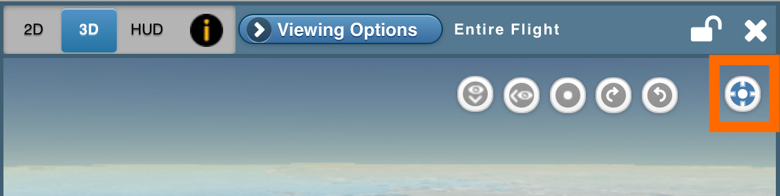
The view will be automatically adjusted so that the aircraft symbol is  positioned at the center of the view.

When you animate (click or tap the Play button), the aircraft symbol will be kept in the center of the view as the background moves around it.

While the moving map is on you can zoom in, zoom out, and change camera positions to move around the aircraft for different viewing angles. You rotate the camera position by dragging the mouse (or finger) right/left and up/down.

Below are a few examples showing how you can use this feature during a debrief.


Example – Crosswind Landing
The moving map helps to see clearly the crabbing, while landing with a crosswind.


Example – Instrument Approach
Using the moving map display to debrief this instrument approach, we can follow along the approach path and rotate the view to look at it from different angles. By rotating the camera around the aircraft, and by zooming in and out, you can see how the pilot intercepted the glide slope from below, and the accuracy of flying the glide slope and the localizer.


Example – Sim flight in a canyon (best in full-screen)
In this simulator flight debrief, we unchecked all the flight segments in the Segment Manager, so only the aircraft symbol is shown.


Example – Sightseeing in Alaska
This sightseeing flight was debriefed on an iPad, with the 3D Track View and Moving Map in the left pane.


CloudAhoy App V6.0 for iOS Released

The CloudAhoy App provides a convenient way to log flight data, with a single click, the data is automatically uploaded into CloudAhoy.  In addition, it provides a way to import flight data from ForeFlightGarmin Pilot, and other EFBs.  And – you can debrief your flight directly in the CloudAhoy App on your device, within minutes after landing. 

CloudAhoy App V6.0 is now available on the App Store. This new version has been rebuilt from the ground up using state-of-the-art technology. It has a new look, and a few enhancements.  More enhancements will follow soon.

To log your flight, just click the red button. The logging will stop automatically, and the flight data will be uploaded to CloudAhoy server. 

Immediately after landing, the flight is ready for debrief – just tap on the D icon which take you to the Post-Flight tab for debrief


During the flight, you can use the In-Flight tab (previously called “CFI tab” in V5), to create markers during the flight – which will be displayed during the debrief.  The In-Flight tab is available in both the iPhone and the iPad. 


Enhancements in V6.0

CloudAhoy App V6.0 has a few enhancements: 

  • Multitasking:

CloudAhoy App V6  supports multitasking – running CloudAhoy side by side with other apps.

Multitasking is useful for using the In-Flight tab to create markers and custom segments during a flight, while using  an EFB such as ForeFlight.


  • Straight to debrief:

For those of you who use the app mostly for debrief and not for logging, you can set the “Post-Flight” tab to be the default when you open the app.  To do so, tap on the Setting icon.

.   

This is useful if you have a configuration in which flight data is uploaded automatically (e.g. using AirSync), thus – you are using CloudAhoy app for debriefing and not for logging.

  • Location Services: 

You can use the “While Using App” setting in iOS. 

If you are not using the app for Logging – e.g. you are configured to automatically upload with AirSync, or you import flights using SD card – you can use “Never”. 

  • Organization branding:


Users who belong to an organization will see their organization’s logo alongside the CloudAhoy logo.


Note about Debrief Tab

Debriefing inside the V6 app is exactly the same as in V5.


Feedback?  Questions?  Suggestions? 


All feedback is welcome!

Click the Feedback icon or send email to Team@Cloudahoy.com


Fun Fact

When Chuck Shavit started to write code for what would later become CloudAhoy, the first thing he wrote was the app.  At the time it was on an iPhone 3 🙂

With the release of V6 of the app, the very first lines of code ever written for CloudAhoy are now retiring!

Throwback image:

CloudAhoy in 2013


Debriefing a Nicely Performed Crosswind Landing

Crosswind landings can be very stressful to pilots of any level. They take skill and practice to perform. And whether you are of the “crab method” or the “wing-low method” on the final approach, both are something pilots have to practice regularly to feel comfortable performing, especially when flying near the top of your personal wind limits. 

Pilot Gary Bond shared a recent flight with us where he executed a very nice crosswind landing. Gary landed on RWY 18L at Huntsville International Airport (HSV) in his Grumman Tiger. Throughout the approach, winds were from the west at approximately 15 knots.

Looking at the green Flight Path Vector, we can see how well the pilot executed a crab angle into the wind to maintain his ground track with the runway centerline. His heading is 194, but the ground track is 185. 

2 mile final:

1 mile final (and additional views):

Reviewing Gary’s score and knowing that there was a 13 kt crosswind on landing, he did well to fly within or close to the goal ranges set by CloudAhoy. There is no doubt that overall he did a very nice job. What is really impressive, and something many pilots struggle with even in light winds (myself included), is the precision with which he landed on the centerline in this crosswind. Even with the safety net of a 150 ft wide runway, CloudAhoy data shows that he landed only ONE foot off center – wow, impressive!! 

For fun, on the right side, we’ve zoomed in to “watch” the landing. We see Gary hold his crab angle nicely over the centerline and then just a few feet above the runway he adds that left rudder to align the nose and the longitudinal axis of the plane with the centerline, touching down straight and center. Nice flying Gary! 


Gary is a GA pilot who loves airplanes and flying, ever since childhood. His first solo was in a glider back in 1991; he earned his private pilot (SEL) certificate in 2000. In 2002, Gary took a 17-year hiatus from flying to help raise his family and has returned to flight by purchasing a 1978 Grumman AA-5B Tiger in 2019. His next goal is an instrument rating. You can watch Gary’s 360-degree flying videos at the Grumman Tiger YouTube Channel

The CloudAhoy Team likes to highlight fun flights and learning moments. If you want to share your flight debrief with us, and possibly have it featured, send us the debrief link and any notes to team@cloudahoy.com.