We released a revised version of the Flights tab, with two important improvements.
The layout of the Flights tab is now adjustable
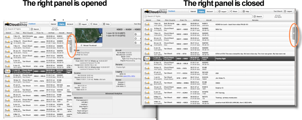
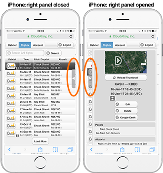
The Flights tab consists of two parts: the flight list (left) and the selected flight’s details (right). A new handle, on the vertical border between the two parts, allows you to close or open the selected flight’s details. Click or tap the handle to toggle open/close.

This adjustable layout is especially handy on narrow displays such as the iPad when you want to view the Remarks fields of all the flights in full.
Reminder: you can always search for flights with specific text in the Remarks (as well as search other flight parameters) using Search on the upper-left.
This functionality is available on the iPad in CloudAhoy app, or in Safari. It is also available on the iPhone in Safari; it is not yet available in the iPhone’s CloudAhoy app. 
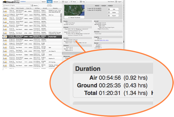
Decimal display of air and ground times (in addition to H:M:S)
Useful for logbook entries – the Air and Ground times are now displayed in decimal values as well.

I find it hard to de-clutter the screen and to remove a display when I click on the X at the top right of the display item.
Hi John,
Thank you for the feedback. I do not fully understand what you were trying to do. Were you debriefing on a computer / tablet / phone? Could you please send more information to team@CloudAhoy.com ?