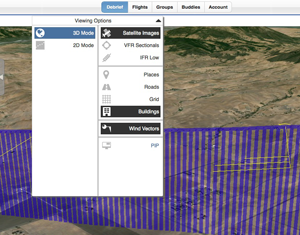
 Those of you who debriefed a flight this morning must have noticed new icons on top. Indeed, we implemented a revised design for the Debrief tab’s top bar; it was already getting crowded, and we needed room for growth – expect new features in the near future.
The new icons represent display features. Some selected (black), others unselected (gray). Click or tap anywhere on this bar, and the display options menu will open. Select or unselect options, and close the bar when done.
As always, we are eager to receive your feedback – please send to dev@CloudAhoy.com.