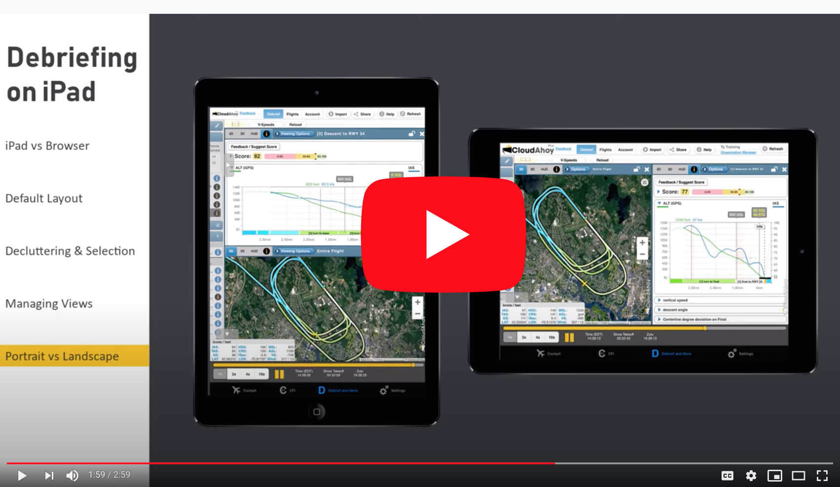
Debriefing directly on the iPad has become increasingly popular. To adjust to the small size of the screen relative to desktop or laptop, we redesigned the tools and layout of iPad debriefing: by default there are two views, and the left panel (including the Segment Manager and tools) is initially collapsed to preserve space.
The new iPad interface is available on both CloudAhoy Standard and CloudAhoy Pro.
Select either a single view on the entire screen, or split it into two views. Open or close the left panel to see the Segment Manager and the Tools – Graphs, Nav, etc. Below are a few examples:
Default view showing a visual approach:
(Screenshot: landscape, CloudAhoy Pro)
Opened the left panel to declutter and show only one of the three closed traffic patterns:
(Screenshot: portrait, CloudAhoy Standard)
After tapping the selected traffic pattern in the Segment Manger, the left panel auto-closes:
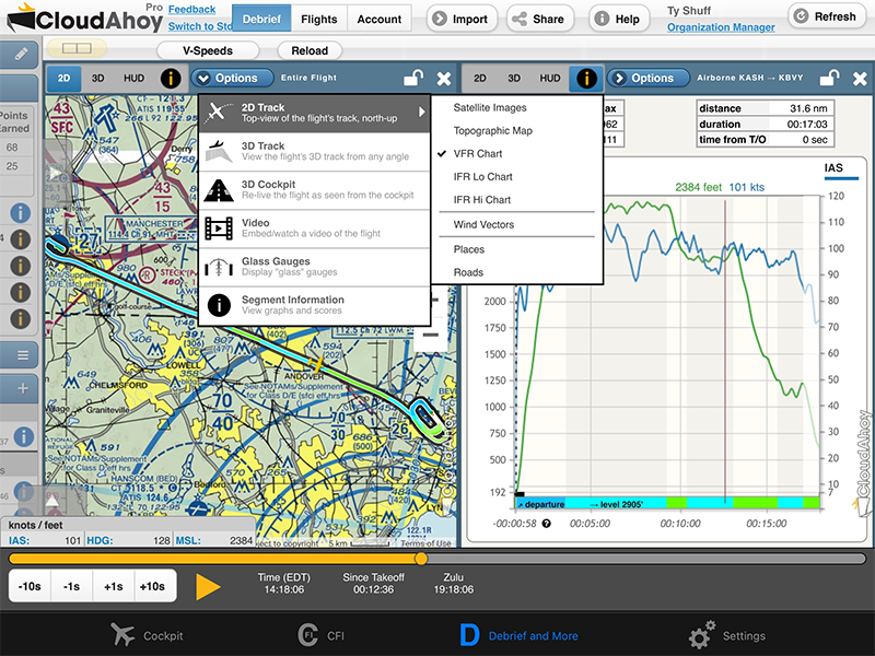
Select any display mode for each of the two views: tap to select between 2D, 3D, HUD and Info. Tap the Options button to further select overlays including aviation charts and wind vectors.
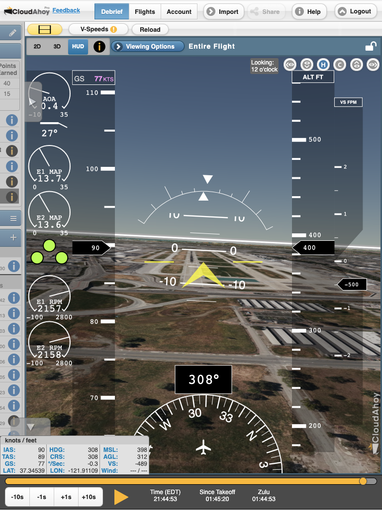
Sometimes you may want to display one view on the entire screen. If two views are displayed, close one of them and the remaining view will grow to fill the screen:
(Screenshot: CloudAhoy Pro, debriefing an X-Plane sim fight)


